
LanguageCert Academic
LanguageCert Academic Speaking Part 2: Role Play Task Format, Scoring, and Strategies
LanguageCert Academic Speaking Part 2 tests your ability to handle real conversations in academic settings. …


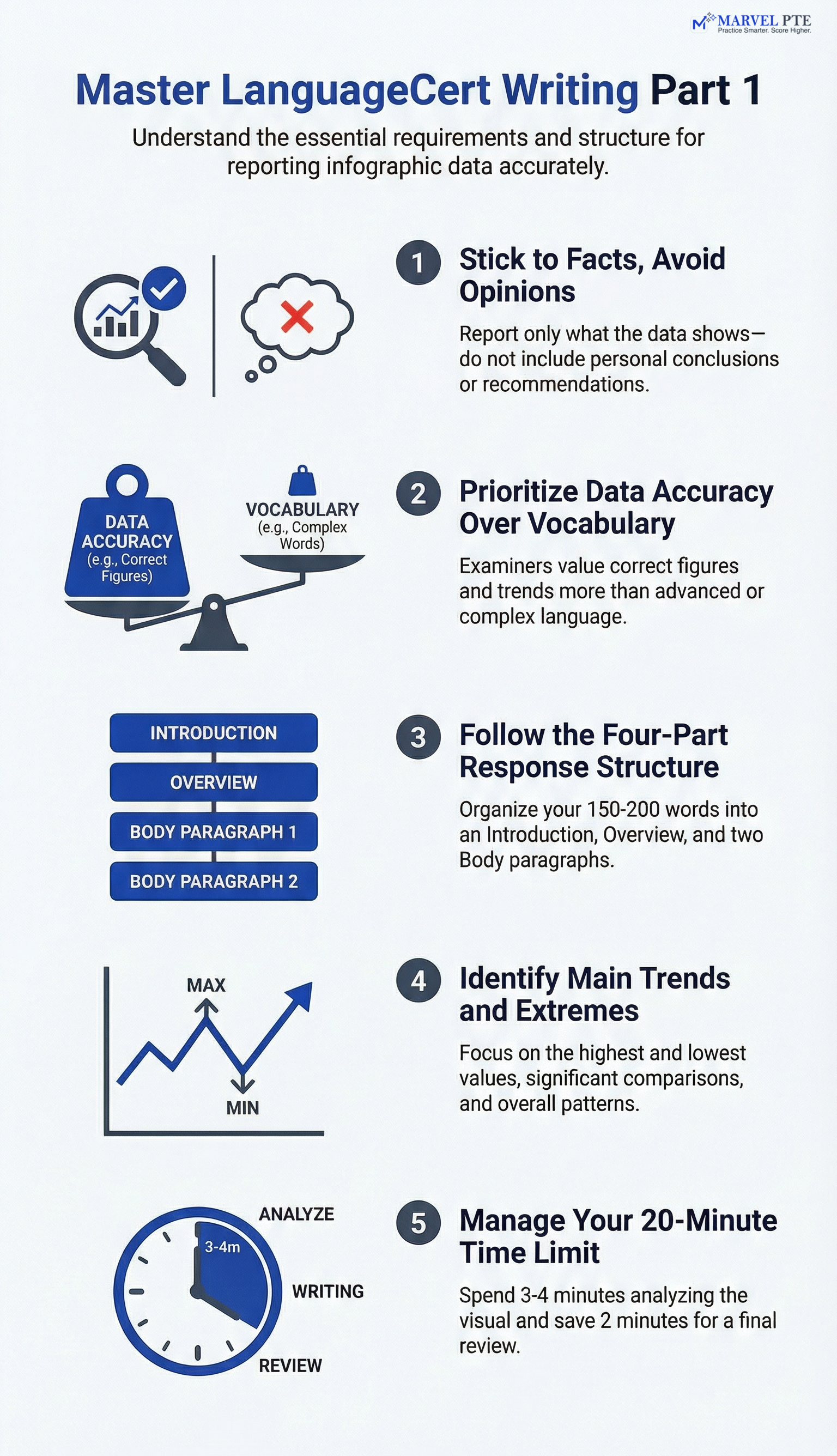
Writing Part 1 in the LanguageCert Academic exam tests your ability to interpret and report visual information. You receive an infographic or chart and must write a short report summarising the main findings and commenting on what might be the underlying reasons. This requires expressing stance, justification, and reasoned analysis as appropriate.
This task matters because academic and professional settings often require you to interpret and communicate data. Whether you are applying for Australian PR or preparing for university, this skill transfers directly to real-world situations.
The LanguageCert Academic SELT examination is an English language test accepted for visa applications and higher education admissions. As an English language qualification, it measures your English proficiency across multiple skill areas including writing, which forms part 1 of the writing section.
Before exam day, candidates should understand how the LanguageCert test compares to other English language requirements like PTE Academic, IELTS Academic, IELTS General Training, Cambridge English, and the Occupational English Test. Each English test has different formats, but the underlying language skill assessment focuses on similar competencies.
Achieving successful completion of Writing Part 1 requires demonstrating academic English abilities. Unlike writing a formal letter or informal correspondence, Part 1 tests your capacity to interpret visual data and produce academic writing. This makes the task more about academic purposes than everyday communication. Learning a foreign language requires dedication, and using practice paper exercises helps identify areas for improvement. Each mistake is a learning opportunity that builds your English language skills over time.
Test results from Writing Part 1 contribute to your overall English language proficiency score. Your test result reflects your ability to handle complex subjects presented in infographic form. The test score depends on how well you address the task, not on using advanced vocabulary or elaborate sentence structures.
Practice smarter with AI-powered mock tests and instant feedback.
Practice describing visual data with instant feedback on your response.
You have 50 minutes for the entire Writing section, which includes two tasks. Part 1 typically takes around 20 minutes and requires 150-200 words.
The task presents you with an infographic containing visual data. Common formats include:
| Visual Type | What It Shows |
|---|---|
| Bar charts | Comparisons between categories |
| Line graphs | Changes over time |
| Pie charts | Proportions of a whole |
| Tables | Specific numerical data |
| Mixed visuals | Combination of formats |
Your job is to report what the infographic shows. You select the most important information, describe key trends, and present the data in a clear, organised way. The examiner looks for accuracy and clarity, not creative interpretation.
Complete a timed Part 1 task under exam conditions.
Human examiners assess your response across four main areas:
Task Achievement Did you cover the key data accurately? Missing major trends or reporting wrong figures will hurt this score. The examiner checks whether your response actually addresses what the infographic shows.
Organisation and Coherence Is your response structured logically? A clear introduction, overview, and body paragraphs show the examiner you can organise information effectively.
Lexical Range and Accuracy Can you use appropriate vocabulary for describing data? Words like “illustrates,” “accounts for,” “remains stable,” and “increased significantly” demonstrate competence. However, accuracy matters more than complexity. A misused advanced word is worse than a correctly used simple one.
Grammatical Control Are your sentences grammatically correct? Consistent errors in tenses, articles, or sentence structure will lower your score. The good news: you do not need complex grammar. Clear, controlled sentences score well.
Key Point: Data accuracy beats advanced vocabulary. An examiner would rather read a simple sentence with correct figures than an impressive sentence with wrong numbers.
Before you write anything, spend 3-4 minutes analysing the visual. Here is what to look for:
Main Trends What is the overall pattern? Is something increasing, decreasing, or staying stable? This goes in your overview.
Highest and Lowest Values Which category has the most? Which has the least? These extremes are almost always worth mentioning.
Significant Comparisons Are two things nearly equal? Is one dramatically different from the rest? Comparisons add depth to your report.
Time-Based Changes If the data covers different years or periods, note how things have changed. “Between 2015 and 2020” or “over the five-year period” shows you understand the timeframe.
A student I worked with in Sydney used to panic when she saw complex infographics. We practised a simple routine: title first, then axes, then biggest numbers, then trends. Within two weeks, she could analyse any chart in under four minutes.
Practice smarter with AI-powered mock tests and instant feedback.
Access our full library of infographics with model answers.

A high-scoring response follows a predictable structure:
Paraphrase the task and state what the infographic shows. Do not copy the title word for word. Instead, rephrase it:
Summarise the main patterns. This is the most important part after task achievement. The examiner wants to see that you can identify what matters:
Describe the key data points in detail. Use specific figures when available:
Continue with remaining important data. Cover contrasts or secondary trends:
Use neutral, academic language throughout. Here are phrases that work well:
| Function | Phrases |
|---|---|
| Showing data | illustrates, presents, shows, depicts |
| Increases | rose, increased, grew, climbed |
| Decreases | fell, dropped, declined, decreased |
| Stability | remained stable, stayed constant, held steady |
| Comparisons | compared to, in contrast to, whereas, while |
| Proportions | accounts for, represents, makes up |
When exact figures are unclear, use approximate language:
This shows flexibility and avoids the trap of guessing specific numbers.
Practice smarter with AI-powered mock tests and instant feedback.
I have reviewed hundreds of Part 1 responses. These errors appear most frequently:
Unsupported Speculation “I think the government should invest more in digital literacy.” While Part 1 asks you to comment on underlying reasons, avoid recommendations or speculation that goes beyond what the data supports. Stick to reasoned interpretation of the findings.
Wrong Figures Copying numbers incorrectly is surprisingly common under time pressure. Double-check your key figures during review time.
Writing Conclusions or Recommendations “Therefore, companies should target younger audiences.” Part 1 does not ask for your conclusions. Stop after describing the data.
Focusing on Minor Details Mentioning every single data point leaves no room for analysis. Select the most significant information and describe that well.
Skipping the Overview Some candidates jump straight into details. Without an overview, the examiner cannot see that you understood the big picture.
Poor Paragraph Structure A wall of text suggests disorganisation. Use clear paragraph breaks to show logical progression.
These approaches consistently help candidates score higher:
Scan Before Writing Look at the infographic for at least three minutes. Identify the two or three most important things before you touch the keyboard.
Plan Your Structure Know where your overview ends and your body begins. A mental outline prevents rambling.
Stick to What You See If the infographic does not show it, do not write it. Assumptions and inferences cost marks.
Keep Sentences Controlled Short, clear sentences with correct grammar beat long, complex sentences with errors. When in doubt, simplify.
Save Time for Review Spending 18 minutes writing and 2 minutes checking catches errors that would otherwise cost marks.
What is the word count requirement for LanguageCert Writing Part 1?
How much time is recommended for Writing Part 1?
What should you include in the overview paragraph of Part 1?
Which of the following is a common mistake in Part 1?
How is LanguageCert Writing Part 1 scored?
Preparing for Part 1 requires practice with the right materials. Marvel Edu provides:
Realistic Infographic Tasks Our practice questions use the same visual formats you will see on test day. Bar charts, line graphs, pie charts, and mixed visuals covering academic topics.
Structured Response Templates Not rigid templates that sound robotic, but clear frameworks showing how to organise your introduction, overview, and body paragraphs effectively.
Automated Feedback Our AI analyses your response for task achievement, coherence, and language accuracy. You see exactly where you lost marks and what to improve.
Timed Practice Mode Practice under the same 20-minute conditions you will face. Building speed without sacrificing accuracy takes repetition.
What is the word limit for Writing Part 1?
150-200 words.
How long should you spend on Part 1?
Around 20 minutes (3-4 min analyse, 12-14 min write, 2-3 min review).
What does Part 1 ask you to do?
Write a report or article based on an infographic or chart.
What analysis does Part 1 require beyond summarising data?
Comment on underlying reasons for the findings, expressing stance and justification.
What types of visuals appear in Part 1?
Bar charts, line graphs, pie charts, tables, and mixed visuals.
What should the introduction do?
Paraphrase the task and describe what the infographic shows.
What should the overview include?
The main trends or overall patterns in the data.
Who scores Writing Part 1?
Human examiners, not AI.
What is more important: accuracy or advanced vocabulary?
Data accuracy is more important than complex vocabulary.
What should you avoid in the final paragraph?
Personal conclusions or recommendations not supported by data.
Before you move to Part 2, confirm you can answer yes to these questions:
Writing Part 1 rewards preparation. The format is predictable, the scoring is transparent, and the skills transfer to real academic work. With focused practice and attention to the criteria above, you can approach this task with confidence.
Watch expert strategies for interpreting and reporting visual information.

LanguageCert Academic Speaking Part 2 tests your ability to handle real conversations in academic settings. …

LanguageCert Academic Speaking Part 3 tests two skills in one task: reading aloud and expressing an opinion. …


LanguageCert Academic Speaking Part 1 is the opening section of the speaking test, where the examiner asks you …
